Zesty.io Accounts app
This will serve as both an announcement and an explanation. An announcement that our Accounts-UI react/redux app will be open to the public.
We are looking forward to having this work open for developers to view, learn from, and even inform us on places where we could make improvements. In the process of this build we have made decisions, many in fact that deserve a walk through.
There are about 25000 lines of code in this app, so we can only cover some ideas in this article. Our largest decisions center around using React, managing our Redux state, and I’ll introduce our component library/design system.
Before we get into details it would probably be useful for you to have a bit of background on Zesty.io and what this app is responsible for. Zesty.io is a SaaS model WCMS (Web Content Management System).
We are focused on small to medium enterprise customers who need to get their content to every corner of the internet through websites, native apps, IoT devices, and more. The app we are discussing is not a content management portal, but an account app.
Our users use it as a gateway to spin up instances, manage collaborators as well as details related to the instance. You could think of it as the gateway to managing your content across many instances.
Developers often articulate in snorts and grunts that Redux and it’s boilerplate is overkill for most cases, that isn’t wrong. It does take a bit of doing to get it set up. However those are just trees, and I’m here to show the forest. Our problem is one of data, persistence, and organization. Anyone who has passed props to a react component knows that if you need data more than a couple layers deep it can become, I’ll say-
‘mind numbingly repetitive to continually pass this information along the chain of components to the data’s final destination’. — Grant Glidewell
Now this could be solved a few ways. For data that is not small and is needed in multiple places across the app or comes from multiple different resources from our API, it can be a bit tricky.
In the case of a new user on Zesty, they create an account, confirm their email address, and log in. Once a user creates an instance, and picks a blueprint (these are templates with corresponding data structures for content ready to use) the instance overview opens and allows the user to edit multiple aspects of the instance. Our Redux store looks like this-
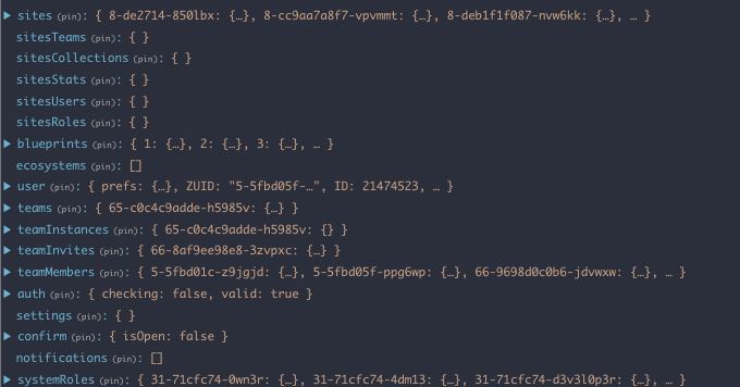
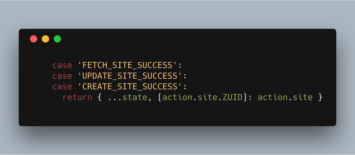
As you can see this is quite a bit of data. We have a user, blueprints, teams that this user may belong to, instances this user has access to, related data for each of those and more ancillary items to make rendering decisions. The stores data are keyed to a unique ID. When the request comes back from the database sometimes our reducer is simple.
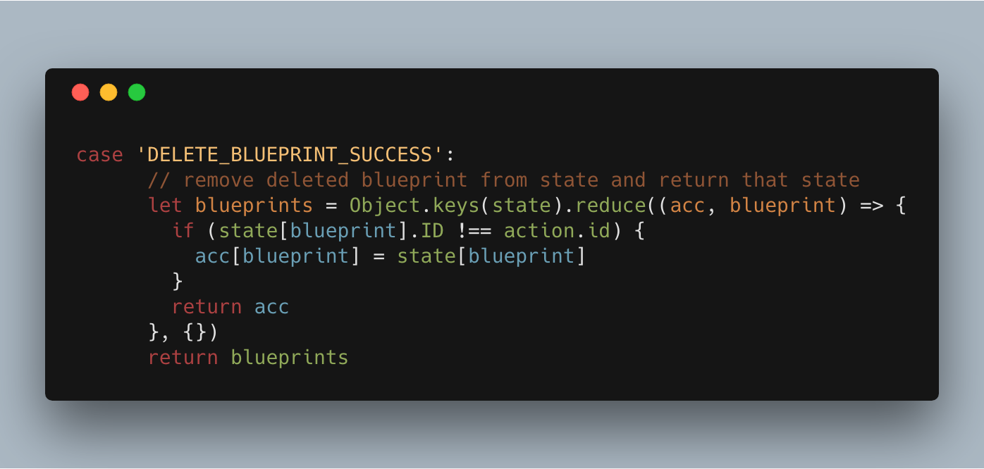
Other times, like in the case of removing data from a store it gets a bit less straightforward but still manageable.
In mapStateToProps we can make sure we are passing along only the relevant information to each component. This closely follows the suggestions of the redux documentation, as we have normalized our data across each store so referencing can be done easily.
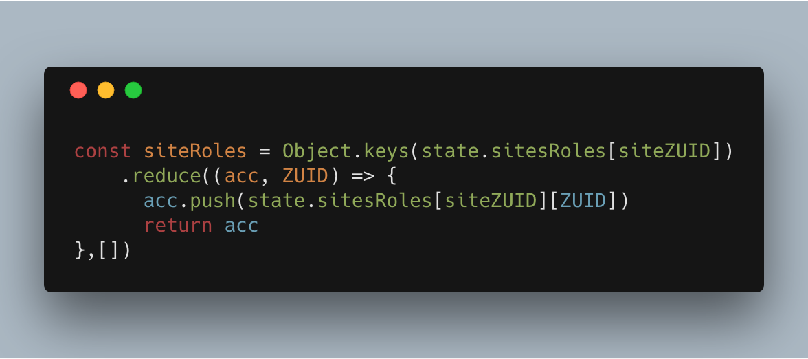
Across our entire app we use this key reference method. It is sometimes cumbersome to map through, however if I need to check a user’s role in relation to an instance anywhere in the app I know exactly where that information lives.
This pattern also further abstracts our views from the data layer. Speaking of views, let’s get into how our components are structured.
Our app is wrapped in validation. Our public routes are always available, but the core app isn’t rendered at all until a user has a validated session. Sub-apps are segmented into the individual use case of each app, in this case they break down into tabs in the main app. Our teams sub app has a few aspects that may be of interest and illustrates our approach clearly.
Only a single view is necessary in this sub app. The main view is responsible for making the initial data fetch for the teams this user belongs to or has invites for. These are called in componentDidMount using promise.all, since our main TeamsGrid element is wrapped in ourWithLoader component we can condition it’s render on those calls coming back from the API.
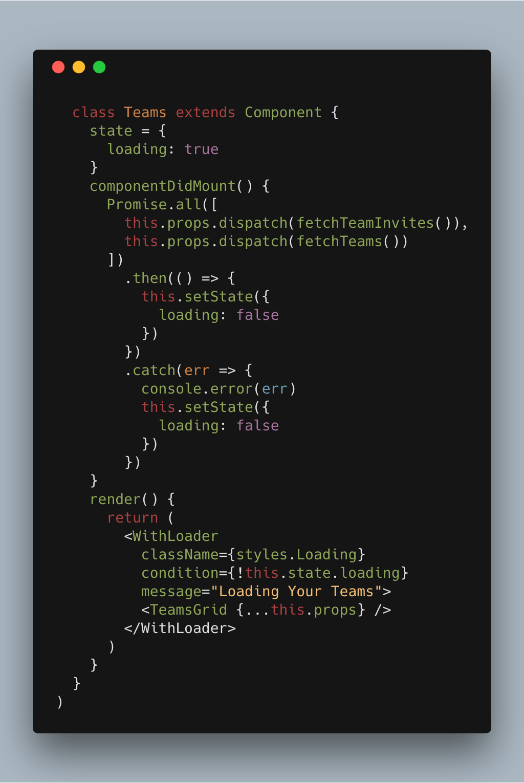
Handling the data up front allows us to make some cleaner components that are unencumbered by the initial API calls and data structure changes that may have to happen.
Our TeamsGrid component renders out three other components- CreateTeam which is responsible for team creation, InviteCard which renders teams a user does not have access to yet but is invited to, and TeamCard showing what other users are on a team and what instances the team is assigned to.
Each of these components deals only with a thin slice of the state, and only use actions pertaining to that slice. The segmentation helps keep the development process simple, these concerns have been decoupled and therefore are autonomous pieces.
For a moment let’s look at how this might work in a tightly coupled scenario. I am a user, I have a team that I am working with. I go to see who has accepted their team invitations and see that ‘George’ has joined my Developer team for a project I am very excited about.
At this point the App has fetched my team members for this team, and also the instances we are assigned to work on. I click through to one of the instances my team is assigned to sending me over to the Instances sub-app. I am brought to the instance overview for that instance which also has to make API calls.
This component does not know that I’ve just come through from the Teams sub-app and that I already have the team data, and so it waits for that information to come back from the API to render.
This is a waste of network resources as we have now made duplicate calls in rapid succession. We have also wasted precious milliseconds waiting on information that could easily be referenced from another place in the global state. Not only is there the practical advantage here of having a global state to call upon, but this is an asset for a mental model as well.
In working on this app we were able to build out components, with concern for how they will work with each other, not having to concern ourselves with the data flow.
All of this component talk has me itching to discuss a fun by-product of this process. In the spirit of ‘re-usability’ and explicit, declarative, functional, more buzzwordy development; we have started to build out our design system.
Our needs are fairly simple. We need styled wrappers over inputs to match our general theme, as well as some more specific elements for our layout. We follow ‘atomic design’ principals put forth by Brad Frost.
As our needs and team grows this project will become more integral in our future work. Having a repository full of standardized components to pull from will make adding features quite a bit quicker. It also serves the dual purpose of making updates to our UI possible from a single place.
The overarching theme with all of this is decoupling. As we have decoupled data from actions, actions from views, views from UI elements. The freedom this allows is significant and feels smooth and seamless in the end result.
The initial investment in architecture is continuing to pay off. As we progress we plan to make more of our work open to the public.
We look forward to input from the community and hope that some of our decisions help some developers out there with the hard problems.


